Purpose: The document provides a step-by-step guide for
building a dashboard using PowerPivot in Excel 2013. The exercise uses Slicer, a dynamic segmentation and filtration tool, used to control the data displayed by components of the dashboard.
Duration: 25 minutes
Data File: Click on Sample Data and save the data in an Excel Workbook.

2. Copy and paste the school data from the text file into the Excel spreadsheet or import data by clicking on the Manage icon.

3. Click on From Other Sources in the Get External Data group.

4. In the Table Import Wizard Window, Select Text File. Click Next.
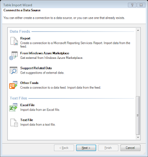
5. Click Browse to select the Text file with data.
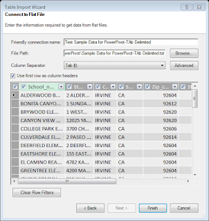
Click on Finish. Click Close when done.
6. To view the table in the data model view, click on Diagram View (View Group)
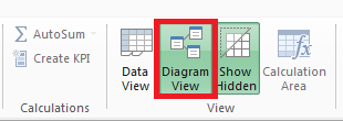
7. It will create a Table in the data model view.
8. Next, add Hierarchy Location with state, city, zip, street to the hierarchy.
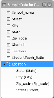
9. Select Pivot Table and then select Four Charts from the drop down menu.
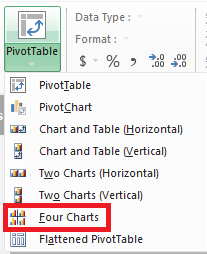
Select New Window and click OK.
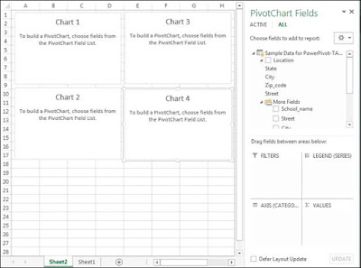
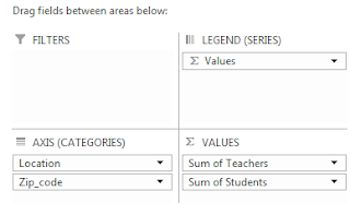
10. Chart 1: Add Location and Zip_code to Axis and Teachers & Student to Values. (Number of Teachers by Zip Code)
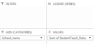
11. Chart 2: Add Location and School_name to Axis and StudentTeach_Ratio to Values cell (Student-Teacher Ratio)
12. Chart 3: Add location and School_name to Axis and Teacher to Values (Number of Teacher by School)

13. Chart 4: Add Location and School_name to Axis and Student to Values cell (Teacher Ratio)
14. Click on View Tab, Turn off the Gridlines

15. Click on INSERT Tab and Select Slicer (Filters group)

16. In the Existing Connections Window, click on Data Model tab and select Tables in Workbook Data Model.

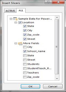
17. Click on Open. In the Insert Slicers Window, select the Location and School_name and now it should look similar to the one displayed below:
18. Right click the Zip_code slicer, select Properties and set the width to 4.
19. Right click the zip_code slicer again, select Report connect and select all the items to connect to the slicer.
20. Right click the School_name slicer, select Report connect and select all the items to connect to the slicer.
21. Select Chart 1, right click and select Hide all field Button on chart to hide the button on the chart. Similarly, hide the field button on rest of the charts.
22. Update the Chart Title for each of the chart.
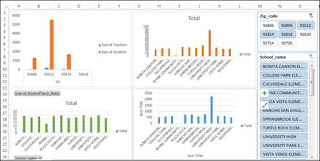
23. Test the dashboard by selecting the zip code. Based on the selected zip code, the dashboard should display the data based on the selected zip code.
For Microsoft Training, click here.
NR Computer Learning Center
http://www.nrclc.com/
No comments:
Post a Comment